
What it is
Joyous provides an affordable monthly subscription of very low-dose (VLD) ketamine. Their platform (JCC) is for providers and nurses to perform tasks like prescribing and verifying patient information.
The Problem
The JCC was created quickly and design was not prioritized. Joyous wanted to make something more intentional and empathetic for professionals using the platform.
The Solution
Joyous hired me (Chelsea Carr) to create a high-fidelity mock-up to pass off to the development team.
My Role
UX/UI Design
Branding & Identity
The Team
Danny Hoz, AI and Innovation
Nayely Gonzalez, Cheif Marketing Officer
Chelsea Carr, Product Designer
Tools
Figma
Deliverables
Prototype
Wireframes
Style Guide
Component Library
Accessibility & Responsiveness
Discovery and Research
Review and Questions
When starting a project I ask a lot of questions. I need to have a deep understanding of the user and what is important to them to best create a design for them.
-
What is the happy path for the user on the platform?
-
What information is needed most frequently by the user?
-
What interactions are happening the most on the platform?
-
How many different users are there and what is different about their process/needs?
-
What are the pain points of the user currently?
-
What is important to the user and shouldn't change?
(And many more questions to follow)
Nurses are using the platform to start patient notes and connect patients with providers
Providers are using JCC to verify documents, write perscriptions, and view their schedule
Both users are on JCC to meet virtually with patients
Original Platform Designs


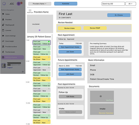
Wireframes
My focus with the wireframes was to group the information so the users could easily skim to find patient information quickly and have a clear view of their actions in order of the appointment flow. I also suggested removing the first screen entirely to save a click for users. Instead, the screen would default to show today with the next patient selected.

After presenting my first pass to Joyous I learned that most users are working on very small and low-resolution screens. I made another version of the wireframe to be better viewed on a small screen.

High Fidelity Mock Up
Style
I brought the wireframes to life with a high-fidelity mock-up. Since their screens haven't had any design focus there were no style guides to go off of. I created a style that included icons, and states of approval, and infused curved edges and monochromatic colors based on their brand identity.
Joyous Brand Guide


Components Created


High-Fidelity Mock-Up

Keeping in mind the resolution and screen size restrictions for users I created a collapsable schedule. All designs are responsive, below shows a 1024 width.
